Thanks for purchasing RedWaves WordPress theme! This extensive and beginner-friendly guide will walk you through the steps on how to install RedWaves and configure it exactly the way you want it.
Prerequisites
In order for RedWaves to function properly, make sure you have at least the below configurations;
- WordPress version 4.7 or greater
- PHP version 5.2.4 or greater
- MySQL 5.0 or greater
Recommended PHP Configurations Depending on your PHP configuration, you might get an error when installing RedWaves from your WordPress dashboard. This is mainly caused by low PHP memory limits. Such error can be fixed by adjusting some PHP configurations limits inside your server PHP.ini file (contact your hosting provider if you don’t have access to this file) as follow:
- upload_max_filesize 48M
- memory_limit 128M
- post_max_size 32M
Installation
Mainly, there are two ways to install RedWaves;
Method 1: Adding via Zip file (Recommended)
- Download redwaves.zip file from your account at devstash.io
- From your WordPress admin dashboard, go to Appearance > Themes > Upload Theme
- Choose redwaves.zip file you just downloaded and click Install Now
- Once the theme is installed, go to Appearance > Themes, select RedWaves then click Activate
Method 2: Uploading via FTP
- Download redwaves.zip file from your account at devstash.io
- Extract redwaves.zip file to your desktop. As a result, you will get redwaves folder
- Connect to your website via your preferred FTP client
- From your FTP client, navigate to the location where your WordPress site is installed
- Once you are in the root folder of your WordPress installation, go to wp-content/themes folder
- Now upload redwaves folder to this location (wp-content/themes)
- From your WordPress admin dashboard, go to Appearance > Themes, select RedWaves then click Activate
Congratulations! Now you have RedWaves successfully installed and activated on your website. Our next step will be how to setup RedWaves. Please keep reading.
Getting Started
In this chapter, we will see how to install recommended and required plugins and import demo content.
Activating Your Theme
When you purchase RedWaves from devstash.io, you will receive a unique license key alongside the theme installation file and additional files if available. You need to use this license key to activate your copy of RedWaves to receive automatic updates.
For now, the license key is only required to receive automatic updates so you don’t have to continuously check devstash.io to see if there is an update available for your theme.
To activate RedWaves, simply go to RedWaves > Theme License, enter your license key in the available text box then click Save Changes. If your key is valid, a new button “Activate License” will appear. Just click this button and your theme will be activated on this specific website. Remember that your license key Never Expires so don’t worry if you get an expiration date. It is just a tiny bug.
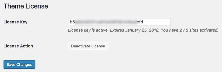
Alternatively, you can do the same thing remotely from your account at devstash.io. So feel free to choose which method you want to use.
Installing Plugins
Out of the box, RedWaves will work just fine without any plugins. But in order to be able to customize the theme, you will need to have Redux Framework plugin installed.
Also, you might want to install other few plugins to make the most out of RedWaves.
To start installing the plugins, click Begin installing plugins link on the notice that will appear at the top of the page.
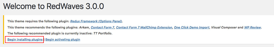
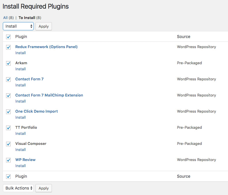
Now, check which plugins you want to install, select Install from the upper dropdown menu then click Apply.
Importing Demo Content (Optional)
In this section, we will see how to import demo content that appear on RedWaves’ demo sites.
To import demo content, from your admin dashboard, go to RedWaves > Import Demo.
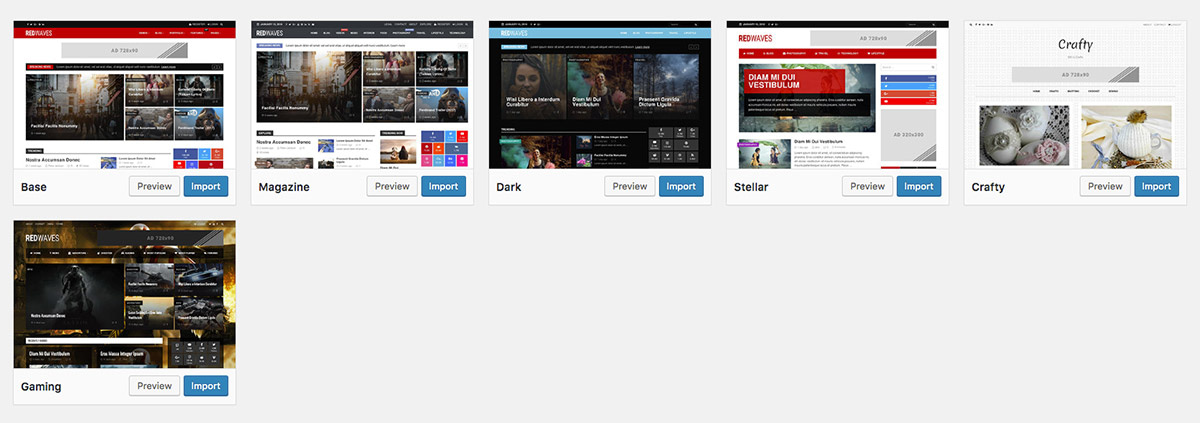
Now, click Import on any demo site of your choice and the import process will be initiated. This should only take few seconds (literally).
Once the import process is finished, your site will look almost identical to the chosen demo site. And by almost I mean that the following will NOT be imported:
- Images that appear on the demo site, including logos, favicons, background images, galleries..etc. Why? You may ask. Because images some server heavy work and usually this will trigger the famous “Maximum Execution Time Exceeded” PHP fatal error on your website.
- RedWaves: Latest Tweets widget and any other widget that require the use of access tokens security keys.
- Image widget because no images will be imported, as previously explained.
- Menus colored tags, icons or any other menu attribute defined by RedWaves.
But you still get a lot of things imported, including widgets, menus, theme options, meta info…etc. The theme will even assign menus to their locations and sets home page and posts page for you.
Theme Options
RedWaves offers wide variety of options. In this chapter we will explain those options.
Most of the options and settings are packed in an options panel powered by Redux Framework plugin. When you have this plugin installed and activated, a new menu entry “Theme Options” will appear under “RedWaves” admin sub-menu. Click it to open the options panel.
General Settings
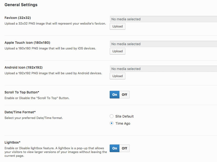
Favicon (32×32) – Use this option to set a favicon for your website. A favicon is simply a tiny square image that will appear (on most browser) on the navigation tab right before your page title. We recommend a 32×32 PNG image.
Apple Touch Icon (180×180) – Use this option to set an icon for your website that will be used mainly by Apple mobile devices. We recommend a 180×180 PNG square image.
Android Icon (192×192) – This icon will be used by Android powered devices. Old versions of Android will use the Apple Touch Icon. But recent versions are now asking for an exclusive icon. 192×192 PNG image is recommended.
Scroll To Top Button – When this option is enabled, a floating button will appear in the buttom-right corner of the screen when a specific scrolling threshold is reached.
Date/Time Format – When the “Site Default” is selected, RedWaves will fallback to the value of the “Date Format” option under Settings > General. But when this option is set to “Time Ago”, dates and timestamps will be converted to a Youtube-alike format.
Lightbox – When enabled, images that link to an image file will no longer redirect to another page. Instead, the attached image will be opened in a floating panel known as Lightbox or Fancybox. Very useful feature especially for image galleries.
Header
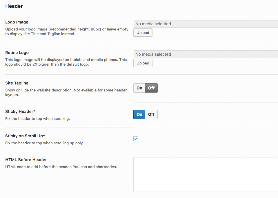
Logo Image – Use this option to set a logo image for your website. We recommend a rectangular image with a height equals to 90 pixels. If not set, your website title will be displayed instead.
Retina Logo – Use this option to set a 2 times or 3 times bigger logo that will be displayed on mobile device and tablets. This option was introduced because mobile devices’ screens these days tend to have much more pixels than desktop devices and laptops.
Site Tagline – If enabled, your site tagline/description will appear below your logo or site title. Please note that the tagline will not be visible for all header layouts (even if this option is enabled).
Sticky Header – When enabled, the header or the main navigation menu (depending on the selected header layout) will be fixed at the top of the page when scrolling.
Sticky on Scroll Up – When active, the site header or main navigation menu will be visible only when scrolling Up. This option depends on the previous option.
HTML Before Header – If you want to add a HTML code at the very top of the page (something like a sitewide notice), add it here. Don’t forget that you can add shortcodes too.
Topbar
The Topbar is a slim horizontal bar that appears right before the website header. This bar can contain many useful information.
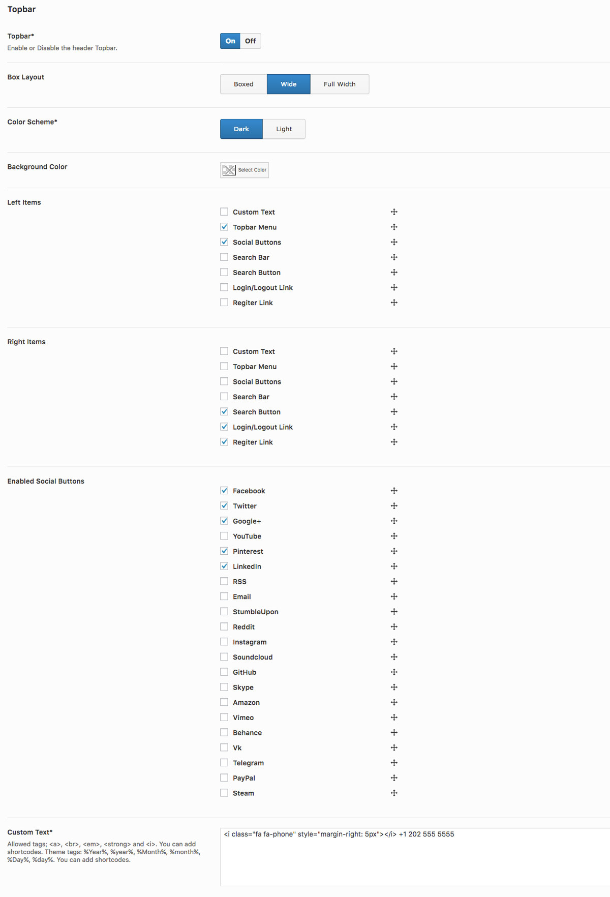
Topbar – Use this option to completely show or hide the Topbar.
Box Layout – When “Boxed” is selected, the topbar container width will not ex
ceed 1200 pixels. When “Wide” is selected, the width will be limited to 1400 pixels. When “Full Width” is selected, the width will be as wide as the browser width.
Color Scheme – If “Dark” is selected, the Topbar text color will be white. If “Light” is selected, the color will be set to black or dark grey.
Background Color – Use this option to choose a solid background color for the Topbar. Remember that you can control the transparency too.
Left Items – Choose which items you want to display in the left area of the Topbar. Remember to assign a menu to the “Topbar Menu” menu location (see Appearance > Menus) if you want to display a menu. Also, you need to choose which social media icons you want to display from the “Enabled Social Buttons” option below if you have “Social Buttons” active. One more thing, you can hold and move the anchor icon to change the order in which these items will be displayed. Cool, right!
Right Items – Please refer to the previous option for more details. They share the same items. The only difference is that selected items here, will be displayed in the right area of the Topbar. Also note that these items will be hidden on mobile phones.
Enabled Social Buttons – From here, you can pick which social icons you want to display. You can hold and move the anchor icon to change the order of the buttons. To set the social links, go to RedWaves > Theme Options > Social Profiles.
Custom Text – Use this option to display a custom text. You can add shortcodes too. Also, this option supports some HTML tags (read the option description for more details).
Header Styling
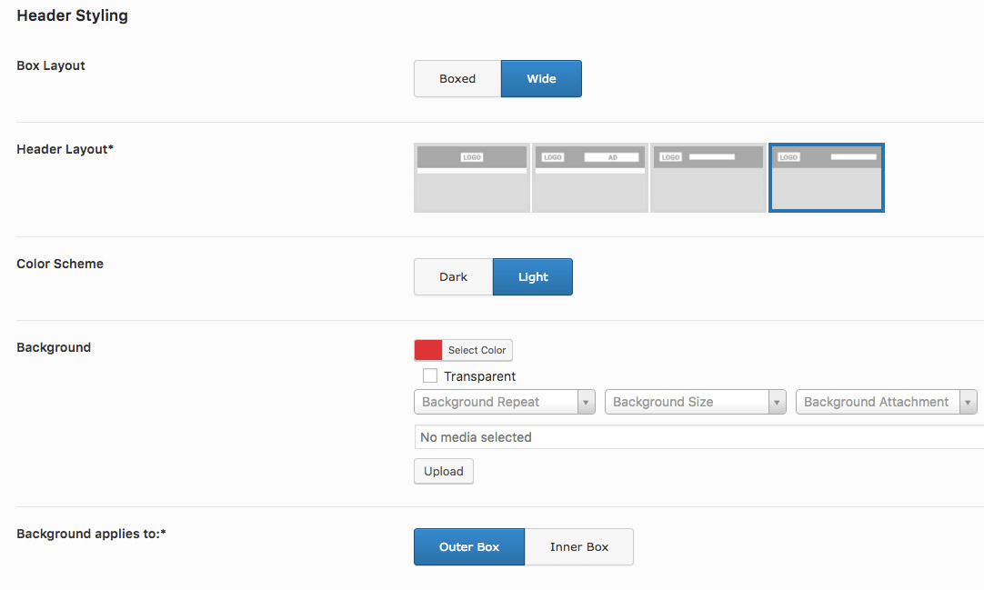
Box Layout – When “Boxed” is selected, the header container width will not exceed 1200 pixels. When “Wide” is selected, the width will be limited to 1400 pixels.
Header Layout – RedWaves supports multiple header layouts. Use this option to select which layout you want to choose.
Color Scheme – If “Dark” is selected, the header text color will be white. If “Light” is selected, the color will be set to black or dark grey.
Background – Use this option to style the header background. You can set a solid color, a background image or both.
Background applies to – If “Outer Box” is selected, the background settings explained in the previous paragraph will be applied to the whole header. If the “Inner Box” is selected, the it will be applied to the inner container inside the header.
Navigation Menus
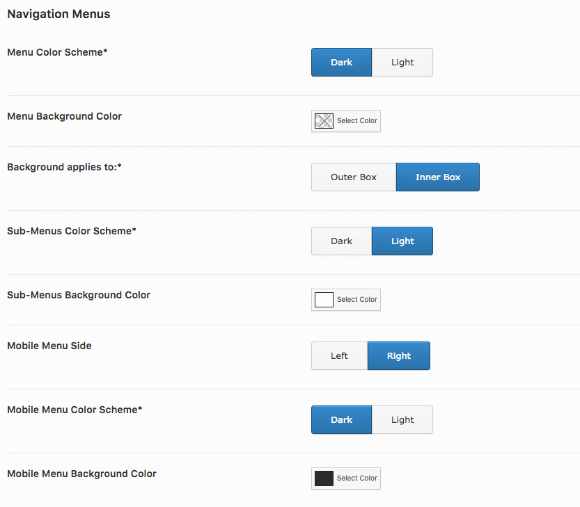
Menu Color Scheme – If “Dark” is selected, the primary menu (top level menu items only) text color will be white. If “Light” is selected, the color will be set to black or dark grey.
Menu Background Color – Use this option to set the background color of the main navigation menu. Just like the previous options, this will apply to the top-level menu items only.
Background applies to – If “Outer Box” is selected, the background settings explained in the previous paragraph will be applied to the main navigation menu. If the “Inner Box” is selected, the it will be applied to the inner container only.
Sub-Menus Color Scheme – If “Dark” is selected, the main menu’s sub-menus (dropdown menus) text color will be white. If “Light” is selected, the color will be set to black or dark grey.
Sub-Menus Background Color – Use this option to set the background color of sub-menus.
Mobile Menu Side – If you choose “Left”, the mobile menu (off-canvas menu) will slide from the left. If you choose “Right”, it will slide from the right.
Mobile Menu Color Scheme – If “Dark” is selected, the mobile menu text color will be white. If “Light” is selected, the color will be set to black or dark grey.
Mobile Menu Background Color – Use this option to set the background color of the mobile menu.
Footer
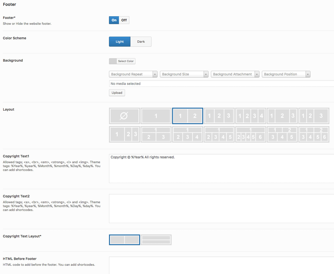
Footer – Use this option to fully show or hide the site footer.
Color Scheme – If “Dark” is selected, footer text color will be white. If “Light” is selected, the color will be set to black or dark grey.
Background – Use this option to style the footer background. You can set a solid color, a background image or both.
Layout – RedWaves comes with a set of predefined footer layouts. Use this option to select your preferred layout. If you select the first image, the footer widgetized area will be completely hidden.
Copyright Text1 – This is the first footer copyright zone. It will either appear on the left or the top side depending on the value of “Copyright Text Layout” option. Read the option description for a list of supported HTML tags and theme tags. Remember that you can add shortcodes too.
Copyright Text2 – This is the second footer copyright zone. It will either appear on the right or the bottom side depending on the value of “Copyright Text Layout” option. Read the option description for a list of supported HTML tags and theme tags. Remember that you can add shortcodes too.
Copyright Text Layout – Use this option to choose the footer copyright zone layout.
HTML Before Footer – If you want to add a HTML code right before the site footer (something like a sitewide notice or an ad), add it here. You can add shortcodes too.
Archives
This section contains archives options. An Archive is a Category, Tag, Author, Date, Custom Post Type or Custom Taxonomy based pages.
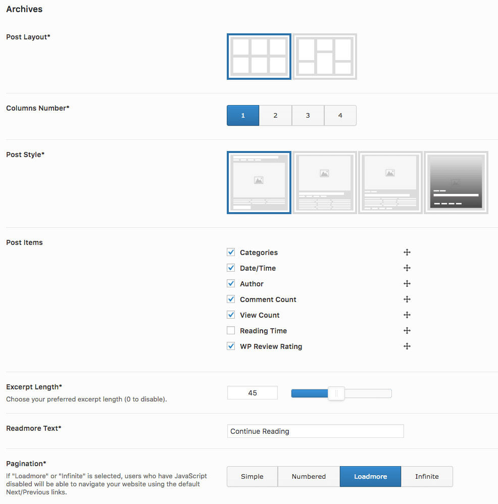
Post Layout – Select your preferred posts listing layout. Either normal grid or masonry grid.
Columns Number – How many posts (columns) to display per row.
Post Style – Use this option to select the post box style.
Post Items – Select which post meta info to display. You can hold and drag the anchor icon to rearrange them.
Excerpt Length – Post short description length in words. Set to 0 to completely hide it.
Readmore Text – The link to individual post text.
Pagination – Pagination type. Select “Simple” for simple older entries and recent entries buttons. Select “Numbered” for numbered pagination buttons. Select “Loadmore” for loading posts via Ajax and “Infinite” for infinite scroll.
Single Posts
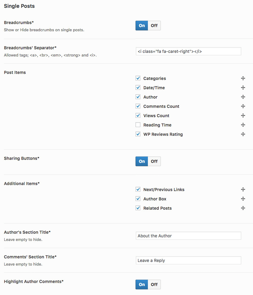
Breadcrumbs – Use this option to show or hide the post breadcrumbs.
Breadcrumbs’ Separator – Read option description for a list of supported HTMl tags. Remember to keep it simple. Even a simple arrow (») character will do just fine.
Post Items – Select which post meta info to display. You can hold and drag the anchor icon to rearrange them.
Sharing Buttons – Use this option to completely show or hide the post sharing buttons. Check “Sharing Buttons” sub-section for more options.
Additional Items – Select the additional single post sections to display below post content. Hold and drag the anchor icon to rearrange.
Author’s Section Title – Author Box section title.
Comments’ Section Title – Comment form section title.
Highlight Author Comments – Turn this option On to highlight post author comments (usually by placing a tiny icon next to author name).
Sharing Buttons
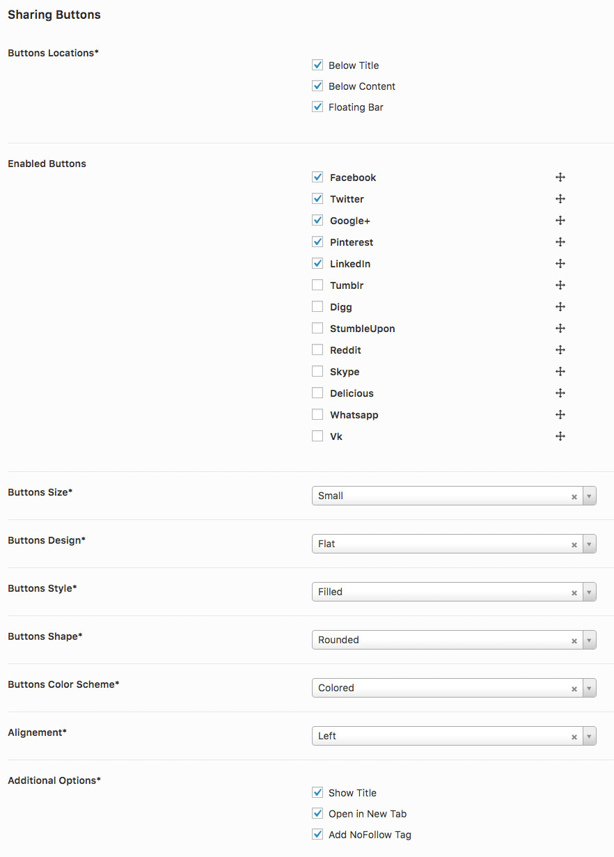
Buttons Locations – Use this option to choose where to show the post sharing buttons.
Enabled Buttons – Use this option to select which sharing buttons you want to display. You can hold and move the anchor icon to change the order of the buttons.
Buttons Size – Sharing buttons size.
Buttons Design – Sharing buttons design.
Buttons Style – Sharing buttons style.
Buttons Shape – Sharing buttons shape.
Buttons Color Scheme – Sharing buttons color scheme.
Alignement – Sharing buttons alignment.
Additional Options – Additional sharing buttons options.
Related Posts
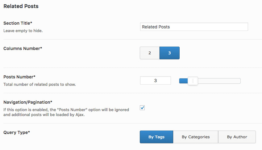
Section Title – Related posts section title.
Columns Number – How many related post to show per row.
Posts Number – In total, how many related posts to display.
Navigation/Pagination – If enabled, additional related posts will be loaded via Ajax.
Query Type – This option will define the filter that will be used to query the related posts.
Styling
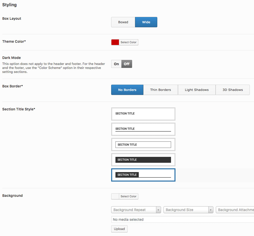
Box Layout – This options applies to the main content container and site footer. Select “Boxed” for narrow container or “Wide” for a bit wider container.
Theme Color – Use this option to set the theme’s primary color.
Dark Mode – If enabled, theme text will be transformed to white and the background to black. Remember to set the “Color Scheme” option to “Dark” for the header and the footer if you want to enable this option.
Box Border – Use this option to set a border or shadow effect to theme sections and widgets.
Section Title Style – Use this option to select the section title style (this will apply to sidebar widgets too).
Background – Use this option to style your website background. You can set a solid color, a background image or both.
Social Profiles
Use this section to define your social media links. Values defined here will be used in different area of your website and by some widgets too.
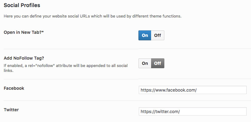
Open in New Tab? – If enabled, social media buttons will open in a new browser tab when clicked.
Add NoFollow Tag? – Not very useful option but it is here just in case you need it. If enabled, all social buttons will have a “rel” attribute set to “nofollow”. This will explicitly tell search engines to ignore those links.
Sidebars
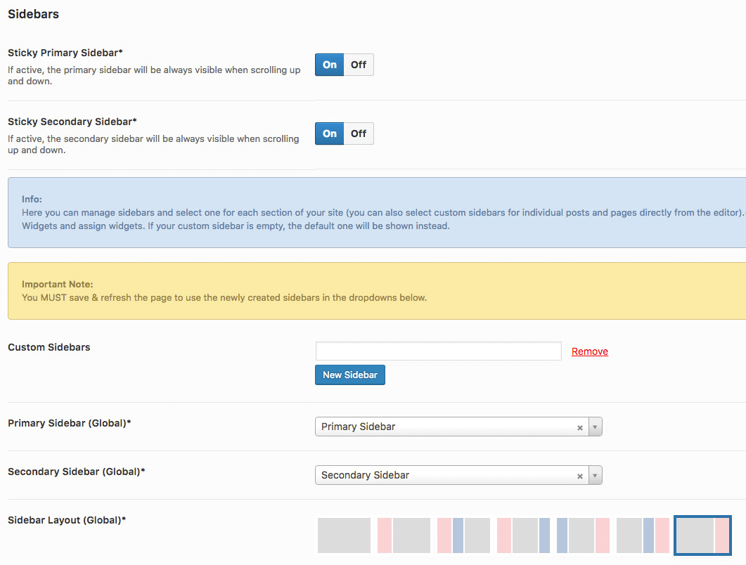
Sticky Primary Sidebar – If enable, the primary sidebar will remain visible (or at least part of it) when scrolling up and down.
Sticky Secondary Sidebar – Same as the previous option. But this option will apply to the secondary sidebar instead.
Custom Sidebars – RedWaves by default, comes with a few predefined sidebars. But if you need more sidebars, you can use this option to register more sidebars. New sidebars will appear on Appearance > Widgets page just like the other sidebars.
Primary Sidebar (Global) – Use this option to select the default primary sidebar for all pages and archives.
Secondary Sidebar (Global) – Use this option to select the default secondary sidebar for all pages and archives.
Sidebar Layout (Global) – RedWaves supports multiple sidebar layouts. Use this option to select one. The red sidebar is the “Primary Sidebar” and the blue one is the “Secondary Sidebar”.
The above options are just the global options. You can override them on specific archives and pages using the other options. If you can even change the sidebar settings on individual pages and posts.
Typography
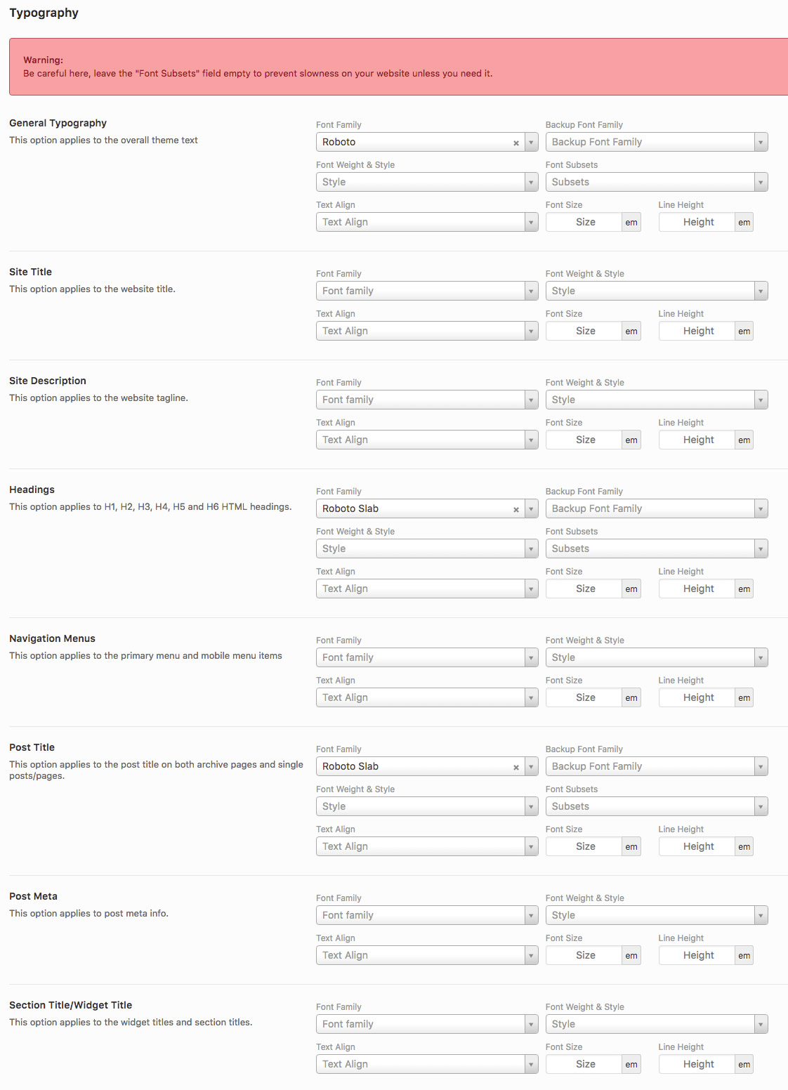
General Typography – General website typography including body text and headings.
Site Title – Website title typography settings.
Site Description – Website tagline typography settings.
Headings – Headings (H1, H2, H3, H4, H5 and H6) typography settings.
Navigation Menus – Primary and mobile menus typography settings.
Post Title – Post/page title typography settings (on both archives and individual posts/pages).
Post Meta – Post meta info typography settings.
Section Title/Widget Title – Section title and sidebar widget title typography settings.
Ad Management
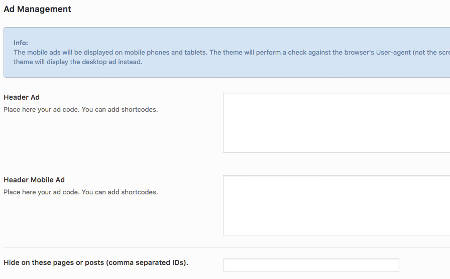
Header Ad – Add your header ad code here.
Header Mobile Ad – If you want to serve a different header ad for mobile users, add its code here.
Hide on these pages or posts (comma separated IDs) – If you want to hide the header ad on specific posts or pages, add their respective IDs here (separated by comma).
The rest of the options in this section are very similar. No further explanation is needed.
Advanced
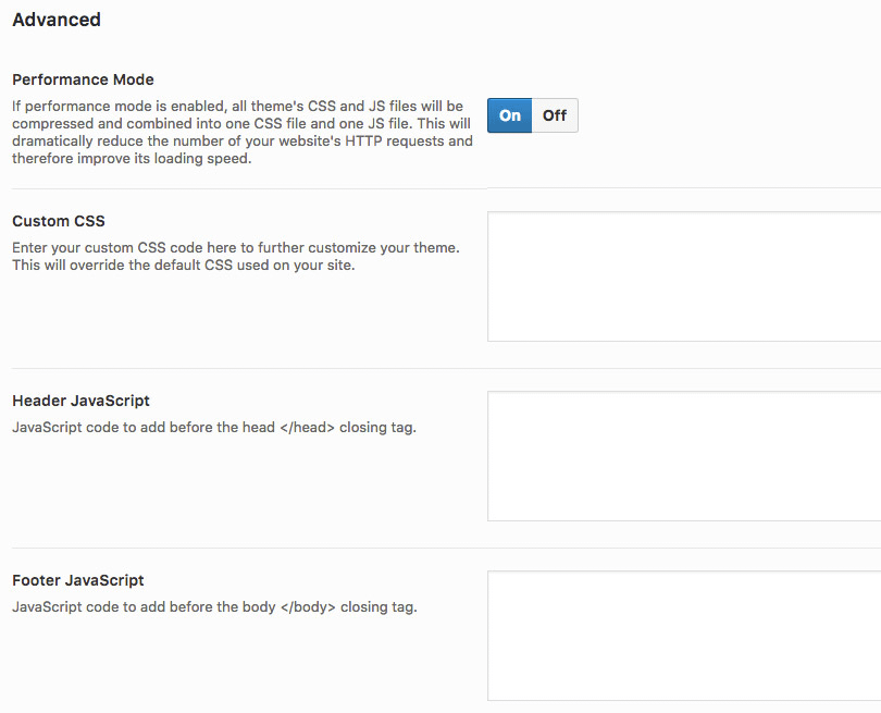
Performance Mode – This option is enabled by default, but you can disable it if you have any JS errors. When this option is enabled, the theme will simply load a compressed CSS file and JS file that contains all the required CSS and JS files combined. This will reduce your website HTTP requests and thus increase the loading speed. When combined with a good CDN service, you are likely to get some impressive results.
Custom CSS – Sometimes you might need to add your own CSS code. Such code should be added here instead of adding it directly to the “style.css” file.
Header JavaScript – If you have a JavaScript code that you want to embed in the header of your website like a Popup ad code, add it here. Remember; only add JavaScript code here.
Footer JavaScript – If you have a JavaScript code that you want to embed in the header of your website like Google Analytics or Tag Manager code, add it here. Remember; only add JavaScript code here.
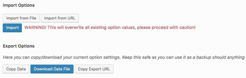
Import/Export Options
This is one of the most useful features of Redux Framework; If you want to use the same theme options on multiple website, you just need to setup them once on one website and then import them to the rest of your websites.
Widgets & Shortcodes
In this chapter, we will explore the available widgets and shortcodes in RedWaves.
Widgets
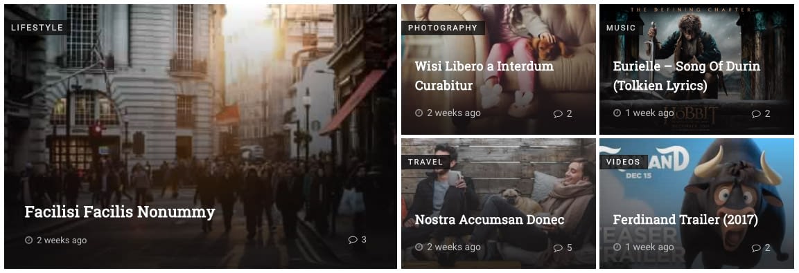
RedWaves: Posts
This widget is very powerful. And frankly, it might be the most powerful widget RedWaves has to offer. You can use this widget to display recent posts, latest updated posts or most commented posts. Additionally, you can filter the posts by a specific category or even filter them by a list of post IDs (when a list of IDs is set, posts will appear in the order the IDs were inserted.
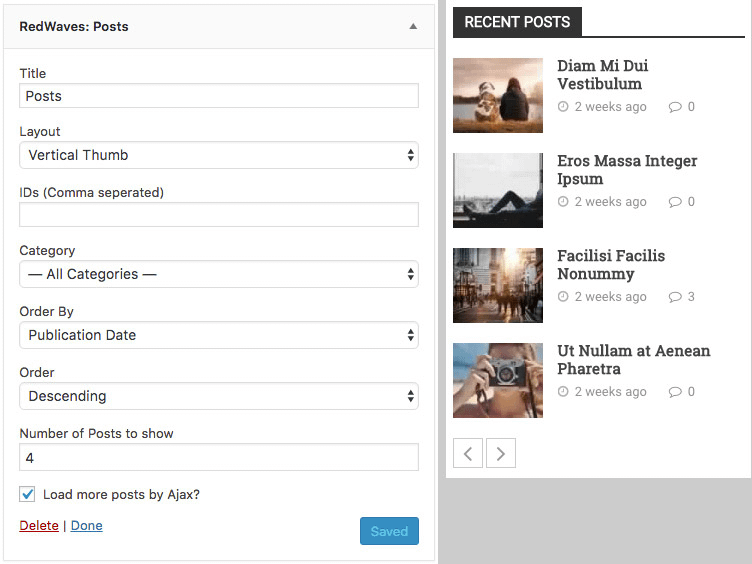
Layout – Post layout/style.
IDs (Comma separated) – List of post IDs separated by comma (the order matters here).
Category – Filter posts by a specific category.
Order By – The order by which the retrieved posts will be sorted.
Order – Designates the ascending or descending order of the “Order By” option.
Number of Posts to show – How many posts to display in total.
Load more posts by Ajax? – When enabled, additional posts will be loaded by Ajax.
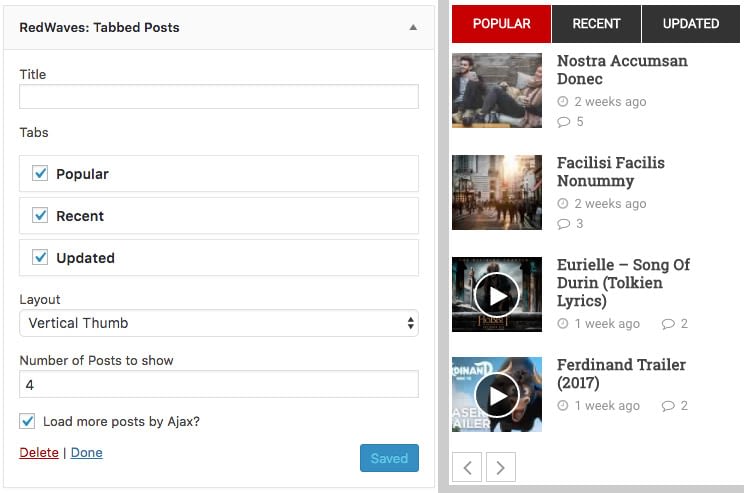
RedWaves: Tabbed Posts
Works very similar to the previous widget. But it allows you to display multiple tabs of posts. You can hold and drag the tabs to order them. Check/uncheck to activate/deactivate the tabs.
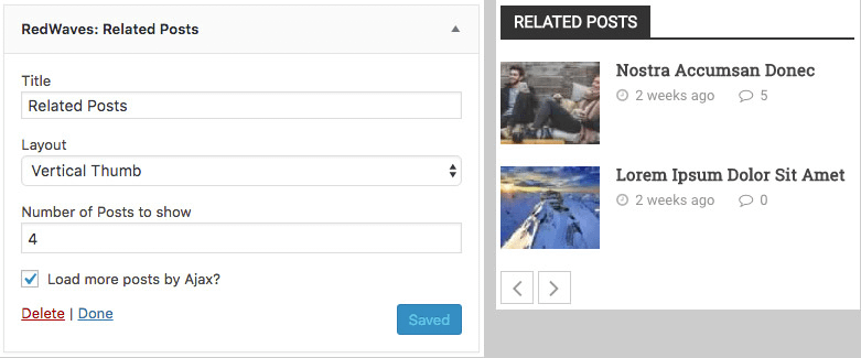
RedWaves: Related Posts
This one too is similar to the previous widgets. But it will always display the related posts relative the the current post being displayed. So this widget will only work on individual posts, else, it will display nothing.
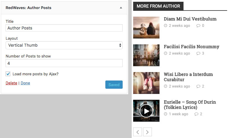
RedWaves: Author Posts
This widget displays a list of posts created by the same author of the current post being displayed. This widget will only work on single posts whose author has more than one post, else, nothing will be displayed.
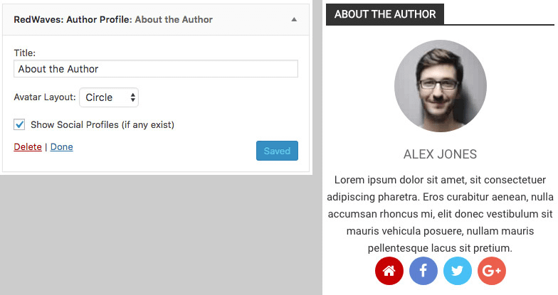
RedWaves: Author Profile
This widget displays the biography and avatar (and social links if available) of the author of current single post being displayed. Again, this widget will only work on individual posts.
RedWaves: Latest Tweets
This widget make use of the Twitter’s API to retrieve your Twitter account recent tweets. So it requires an active Twitter app with valid credentials. To create a Twitter app, visit this
link while logged in and create an app (if you don’t have one already). Once your app is created, go to “Keys and Access Tokens” and copy the provided keys to your widget.
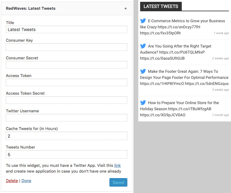
Cache Tweets for (in Hours) – Make sure to set this option to 1 at least. You really don’t want to call the Twitter API every time someone visits your website.
Tweets Number – How many tweets you want to display.
RedWaves: Social Icons
This widget offers a wide variety of styling options, so take your time to find the design that suits your website the most.
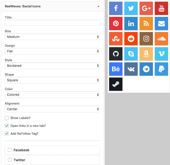
Show Labels? – Enable this option to display social media names.
Open links in a new tab? – If enabled, the link will open in new tab when clicked.
Add NoFollow Tag? – When enabled, social media buttons will have a “nofollow” attribute.
You can hold and drag the buttons to reorder them. Check/uncheck to activate/deactivate them.
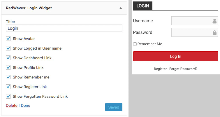
RedWaves: Login Widget
This widget displays a simple login form when not logged in. If you are logged, the widget will display a welcome text, your avatar and some useful links.
RedWaves: Facebook Page Plugin
This widget displays your Facebook page plugin.
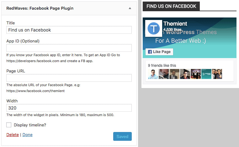
App ID (Optional) – If you have a Facebook app, enter its ID here. For now, this field is totally optional.
Page URL – Enter your Facebook page URL here.
Width – This can be any number from 180 to 500 (in pixels).
Display timeline? – When enabled, your page timeline will be displayed.
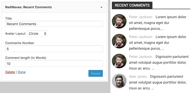
RedWaves: Recent Comments
This widget displays the most recent comments with avatars.
Shortcodes
RedWaves provide a GUI (Graphical User Interface) to deal with shortcodes. So you don’t have to remember all shortcodes and their parameters. Those shortcodes are grouped into two groups:
Builder Shortcodes – These shortcodes are mapped to the Visual Composer page builder. And they are available under Theme elements section. These shortcodes are the following:
- Blog
- Posts
- Blog Grid
- Blog Slider
- Newsbar
- Gallery (Theme version)
- Social Icons
- Share Icons
- Section Title
- Sidebar
- Button
Editor Shortcodes – These shortcodes are available as buttons in the TinyMCE editor (aka visual editor) and they are the following:
- Highlight
- Dropcap
- Notification
- Styled List
- Button
The “Button” shortcode is available under both groups.
Blog
“Blog” shortcode simply displays an archive of posts just like your blog page. This shortcode is very customizable.
Usage example:
[rw_blog title="Recent Posts" columns="2" excerpt="30"]
Title (title) – Section title.
Title Color (color) – Section color.
Posts (ids) – List of posts IDs separated by comma.
Categories (categories) – List of categories IDs separated by comma.
Order By (orderby) – The order by which posts will be sorted. Accepted values: date, ID, author, title, modified, rand, comment_count.
Sort Order (order) – Designates the ascending or descending order of the “orderby” parameter. Accepted values: ASC, DESC.
Posts per Page (per_page) – Number of posts to display.
Layout (layout) – Blog layout. Accepted values: grid, masonry.
Columns (columns) – Number of posts per row. Accepted values: 1, 2, 3, 4.
Style (style) – Post box style. Accepted values: style1, style2, style3, style4.
Excerpt Length (excerpt) – Excerpt length (in words). 0 to disable.
Readmore (readmore) – Readmore button text.
Pagination (pag) – Pagination type. Accepted values: simple, numbered, loadmore, infinite. Leave empty to disable.
Spacing (spacing) – Spacing between posts (in pixels). Accepted values: 0, 2, 3, 5, 8, 10, 15, 20.
Extra Class Name (el_class) – Custom CSS class name.
Css (css) – Css styles (supported by Visual Composer plugin).
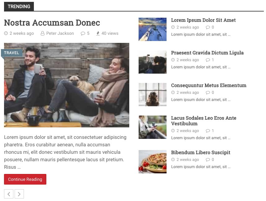
Posts
This shortcode displays a stylish grid of posts. It supports multiple layouts.
Usage example:
[rw_posts title="Trending" per_page="5" columns="2" nav="true"]
Title (title) – Section title.
Title Color (color) – Section color.
Posts (ids) – List of posts IDs separated by comma.
Categories (categories) – List of categories IDs separated by comma.
Order By (orderby) – The order by which posts will be sorted. Accepted values: date, ID, author, title, modified, rand, comment_count.
Sort Order (order) – Designates the ascending or descending order of the “orderby” parameter. Accepted values: ASC, DESC.
Posts per Page (per_page) – Number of posts to display.
Layout (layout) – Shortcode layout. Accepted values: layout1, layout2, layout3.
Columns (columns) – Number of posts per row. Accepted values: 1, 2, 3, 4. Require the “layout” parameter to be set to “layout3”.
Enable Navigation? (nav) – If enabled, more posts will be loaded by Ajax.
Style (style) – Post box style. Accepted values: style1, style2, style3, style4.
Spacing (spacing) – Spacing between posts (in pixels). Accepted values: 0, 2, 3, 5, 8, 10, 15, 20.
Extra Class Name (el_class) – Custom CSS class name.
Css (css) – Css styles (supported by Visual Composer plugin).
Blog Grid
This shortcode displays a gallery of posts in a compact way.
Usage example:
[rw_posts_grid layout="layout1"]
Title (title) – Section title.
Title Color (color) – Section color.
Posts (ids) – List of posts IDs separated by comma.
Categories (categories) – List of categories IDs separated by comma.
Order By (orderby) – The order by which posts will be sorted. Accepted values: date, ID, author, title, modified, rand, comment_count.
Sort Order (order) – Designates the ascending or descending order of the “orderby” parameter. Accepted values: ASC, DESC.
Layout (layout) – Shortcode layout. Accepted values: layout1, layout2, layout3.
Extra Class Name (el_class) – Custom CSS class name.
Css (css) – Css styles (supported by Visual Composer plugin).
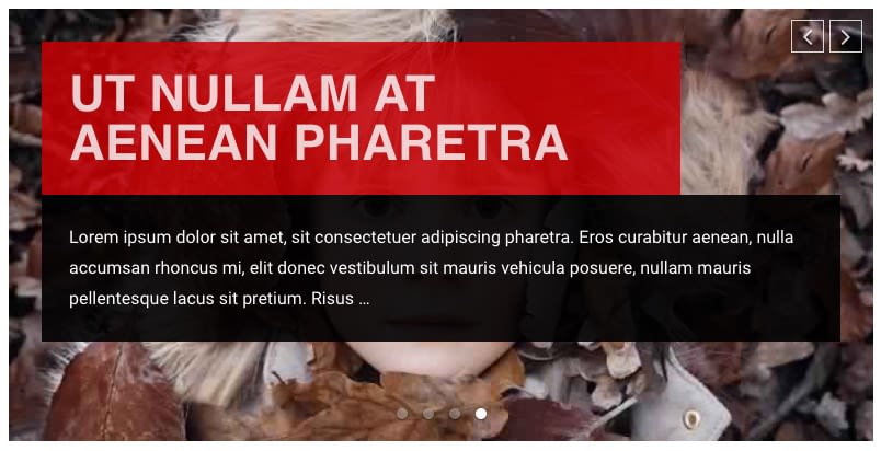
Blog Slider
This shortcode displays a simple yet powerful slider.
Usage example:
[rw_posts_slider per_page="4" animin="fadeIn" animout="fadeOut" shadow="style1" timeout="4000" loop="true" autoplay="true" lazyload="true" nav="true" dots="true" hover="true" pause="true" touch="true" mouse="true"]
Title (title) – Section title.
Title Color (color) – Section color.
Posts (ids) – List of posts IDs separated by comma.
Categories (categories) – List of categories IDs separated by comma.
Order By (orderby) – The order by which posts will be sorted. Accepted values: date, ID, author, title, modified, rand, comment_count.
Sort Order (order) – Designates the ascending or descending order of the “orderby” parameter. Accepted values: ASC, DESC.
Posts per Page (per_page) – Number of slides (posts) to display.
Style (style) – Slide style. Accepted values: style1, style2, style3.
Entrance Animation (animin) – Animation of next slide. Supports all animate.css animations.
Exit Animation (animout) – Animation of current slide. Supports all animate.css animations.
Shadow Style (shadow) – Shadow effect style. Accepted values: style1, style2, style3. Leave empty for no shadows.
Timeout (timeout) – Delay between slides in milliseconds (when autoplay is enabled).
Infinite Loop (loop) – Duplicate last and first items to get loop illusion.
Autoplay (autoplay) – Autoplay.
Lazyload (lazyload) – Lazy load images.
Navigation Arrows (nav) – Show next/prev buttons.
Pagination Bullets (dots) – Show pagination (dots). Show Navigation
Arrows on Mouseover? (hover) – Show next/prev buttons on mouseover only.
Pause on Mouseover? (pause) – Pause on mouseover.
Touch Drag (touch) – Enable touch drag.
Mouse Drag (mouse) – Enable mouse drag.
Extra Class Name (el_class) – Custom CSS class name.
Css (css) – Css styles (supported by Visual Composer plugin).
Newsbar
Displays a news bar.

Usage example:
[rw_newsbar timeout="4000"]Lorem ipsum dolor sit amet, eam sonet nominati intellegebat te, eu vel novum nullam. | Quem necessitatibus per in, mei soluta apeirian ut. Nec cu doming delicata omittantur. | Vis in amet partem laoreet, splendide definitiones ius ut, qui summo essent eu.[/rw_newsbar]
Title (title) – Section title.
Title Color (color) – Section color.
Content – News content separated by vertical bar “|”. You can add links.
Color Scheme (style) – Color scheme or style. Supported values: style1, style2.
Timeout (timeout) – Delay between slides in milliseconds (when autoplay is enabled).
Autoplay (autoplay) – Autoplay.
Navigation Arrows (nav) – Show next/prev buttons.
Pause on Mouseover? (pause) – Pause on mouseover.
Touch Drag (touch) – Enable touch drag.
Mouse Drag (mouse) – Enable mouse drag.
Extra Class Name (el_class) – Custom CSS class name.
Css (css) – Css styles (supported by Visual Composer plugin).
Gallery (Theme version)
Displays an image gallery.

Usage example:
[rw_gallery images="1999,1998" lightbox="true" columns="2" spacing="3"]
Title (title) – Section title.
Title Color (color) – Section color.
Images (images) – Images IDs separated by comma.
Link To (link) – Whether the image will link to media file or attachment page or nothing. Accepted values: file, post, none.
Lightbox – Open gallery in lightbox.
Columns (columns) – Number of images per row. Accepted values: 1, 2, 3, 4, 6.
Layout (layout) – Gallery layout. Accepted values: grid, masonry, mosaic, carousel.
Thumbnail Size (size) – Image size. Accepts all registered thumbnail sizes.
Spacing (spacing) – Spacing between posts (in pixels). Accepted values: 0, 2, 3, 5, 8, 10, 15, 20.
Entrance Animation (animin) – Animation of next slide. Supports all animate.css animations.
Exit Animation (animout) – Animation of current slide. Supports all animate.css animations.
Timeout (timeout) – Delay between slides in milliseconds (when autoplay is enabled).
Infinite Loop (loop) – Duplicate last and first items to get loop illusion.
Autoplay (autoplay) – Autoplay.
Lazyload (lazyload) – Lazy load images.
Navigation Arrows (nav) – Show next/prev buttons.
Pagination Bullets (dots) – Show pagination (dots).
Show Navigation Arrows on Mouseover? (hover) – Show next/prev buttons on mouseover only.
Pause on Mouseover? (pause) – Pause on mouseover.
Touch Drag (touch) – Enable touch drag.
Mouse Drag (mouse) – Enable mouse drag.
Extra Class Name (el_class) – Custom CSS class name.
CSS (css) – Css styles (supported by Visual Composer plugin).
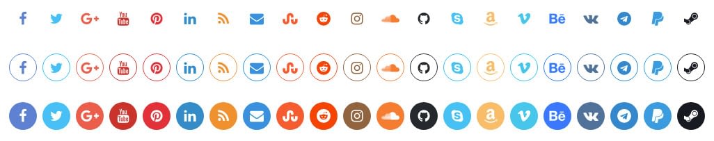
Social Icons
Displays social buttons.
Usage example:
[rw_social_icons new_tab="true" no_follow="true" facebook="true" twitter="true" google_plus="true" youtube="true" pinterest="true" linkedin="true" rss="true"]
Size (size) – Buttons size. Supported values: small, medium, large.
Design (design) – Buttons design. Supported values: flat, material, 3d.
Style (style) – Buttons style. Supported values: simple, bordered, filled.
Shape (shape) – Buttons shape. Supported values: circle, rounded, square.
Color (color) – Buttons color. Supported values: light, dark, colored.
Alignment (align) – Buttons alignment. Supported values: left, center, right.
Open links in a new tab? (new_tab) – Open links in new browser tab.
Add Nofollow Tag? (no_follow) – Add NoFollow attribute to links.
Extra Class Name (el_class) – Custom CSS class name.
CSS (css) – Css styles (supported by Visual Composer plugin).
Supported social media channels: facebook, twitter, google_plus, youtube, pinterest, linkedin, rss, email, stumbleupon, reddit, instagram, soundcloud, github, skype, amazon, vimeo, behance, vk, telegram, paypal, steam.
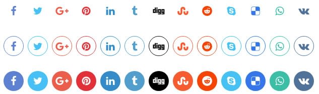
Share Icons
Displays share icons.
Usage example:
[rw_share_icons new_tab="true" no_follow="true" facebook="true" twitter="true" google_plus="true" pinterest="true" linkedin="true" tumblr="true"]
Size (size) – Buttons size. Supported values: small, medium, large.
Design (design) – Buttons design. Supported values: flat, material, 3d.
Style (style) – Buttons style. Supported values: simple, bordered, filled.
Shape (shape) – Buttons shape. Supported values: circle, rounded, square.
Color (color) – Buttons color. Supported values: light, dark, colored.
Alignment (align) – Buttons alignment. Supported values: left, center, right.
Open links in a new tab? (new_tab) – Open links in new browser tab.
Add Nofollow Tag? (no_follow) – Add NoFollow attribute to links.
Extra Class Name (el_class) – Custom CSS class name.
CSS (css) – Css styles (supported by Visual Composer plugin).
Supported social media channels: facebook, twitter, google_plus, pinterest, linkedin, tumblr, digg, stumbleupon, reddit, skype, delicious, whatsapp, vk.
Section Title
Displays a section title just like the sidebar widget title.
Usage example:
[rw_section_title title=”Section Title” color="#dd3333"]
Title (title) – Section title.
Title Color (color) – Section color.
Extra Class Name (el_class) – Custom CSS class name.
CSS (css) – Css styles (supported by Visual Composer plugin).
Sidebar
Displays a WordPress sidebar.
Usage example:
[rw_sidebar sidebar="sidebar-1"]
Sidebar (sidebar) – Sidebar ID. Leave empty to display the Primary Sidebar.
Extra Class Name (el_class) – Custom CSS class name.
CSS (css) – Css styles (supported by Visual Composer plugin).
Button
Displays a button.

Usage example:
[button anchor="Click Me" url="#" style="metro" color="blue-sky" new_tab="true" no_follow="true"]
Anchor (anchor) – Button text.
URL (url) – Button URL.
Size (size) – Button size. Supported values: medium, lg, sm.
Style (style) – Button style. Supported values: default, hero, metro, material.
Color (color) – Button background color scheme. Supported values: primary, default, success, info, warning, danger, flickr, sunset, juicy-orange, blue-sky, stripe, happiness, deep-space.
Full-Width? (block) – Make the button as wide as its container.
Open links in a new tab? (new_tab) – Open links in new browser tab.
Add Nofollow Tag? (no_follow) – Add NoFollow attribute to links.
Extra Class Name (el_class) – Custom CSS class name.
CSS (css) – Css styles (supported by Visual Composer plugin).
Highlight
Highlight a text.
Usage example:
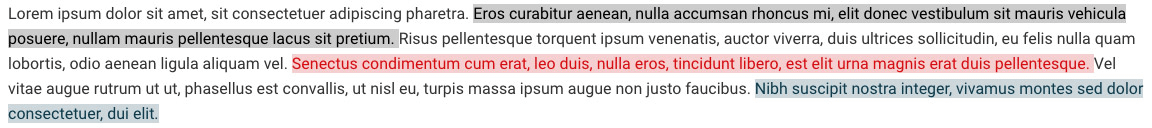
[highlight color="#8c1515"]Lorem ipsum dolor sit amet, eam sonet nominati intellegebat te, eu vel novum nullam.[/highlight]
Content – Text to highlight.
Color – Highlight color. Supports Hex colors only.
Dropcap
Displays a dropcap.

Usage example:
[dropcap]Lorem ipsum dolor sit amet, eam sonet nominati intellegebat te, eu vel novum nullam.[/dropcap]
Content – Text to which a dropcap will be added.
Notification
Displays an alert (notification).
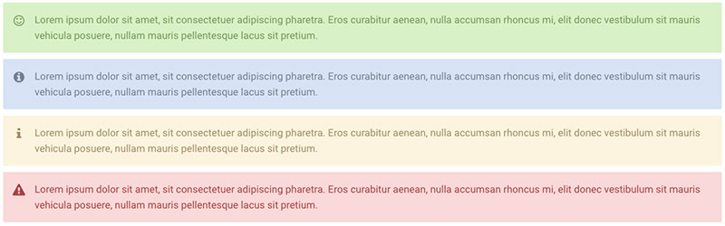
Usage example:
[notification style="success"]Lorem ipsum dolor sit amet, eam sonet nominati intellegebat te, eu vel novum nullam.[/notification]
Content – Notification text.
Style (style) – Notification style. Supported values: success, info, warning, danger.
Styled List
Displays a styled list.
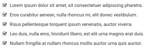
Usage example:
[styledlist style="star"]
    <ul>
        <li>Lorem ipsum dolor sit amet.</li>
        <li>Vis in amet partem laoreet.</li>
        <li>Quem necessitatibus per in.</li>
    </ul>
[/styledlist]
Content – A HTML unordered list.
Style (style) – List style. Supported values: normal, star, yes, no.
Pages & Menus
If you’ve been reading this guide since the beginning, then you should be ready to start building your own pages using the included Visual Composer plugin.
If you are not familiar with Visual Composer (aka WPBakery Page Builder), we highly recommend reading the official documentation here. In this chapter, we will cover only the basics of using this plugin.
Setting a Static Front Page
If you have imported one of the demo sites using the method explained in the “Getting Started” chapter, you can jump this section. But if you didn’t, please keep reading..
Let’s start by creating two pages: Home and Blog.
To create those pages, go to Pages > Add New, fill in the page title then click Publish.
Once the pages are created, go to Settings > Reading and set the option “Your homepage displays” to “A static page (select below)”. Now set “Homepage:” to your Home page and “Posts page:” to your Blog page. Then click Saves Changes.

Now, your homepage will display the content of your Home page and your Blog page will list your latest posts.
Page Options
RedWaves make use of WordPress post meta-data to add some options on individual pages. These options are packed in one metabox “Page Options”.
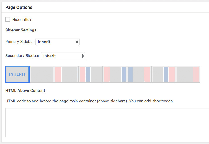
Here is a brief explanation of each option;
Hide Title? – If enabled, page title will be hidden.
Primary Sidebar – The sidebar that will be used as Primary Sidebar. Set to “Inherit” to use the default one.
Secondary Sidebar – The sidebar that will be used as Secondary Sidebar. Set to “Inherit” to use the default one.
Sidebar Layout – Select an image to change the sidebar layout or select the first one to use the default layout. The Red rectangle is the Primary Sidebar and the Blue one is the Secondary Sidebar.
HTML Above Content – The content of this option will be displayed right above the page content (above the main container). You can add here any HTML code. You can add shortcodes too.
Using the Page Builder
Now let’s add some content;
From the post editor click the “Frontend Editor” button (make sure Visual Composer is installed and activated first). You will be redirected to VC frontend editor.
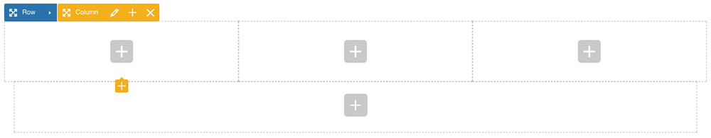
Adding Rows
Basicly, a row is a wrapper that holds one column or multiple columns depending on the row layout you choose.
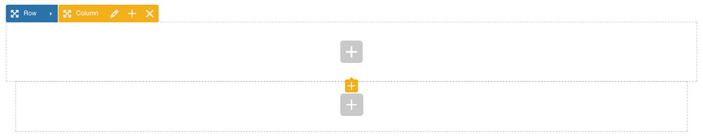
Click “Add Element” and choose “Row”. Congrats! Now you have created your first row.
Adding Columns
A column is block that holds other block of contents. In Visual Composer, these blocks are called elements (including rows and columns).
By default, each row will have one single full-width column created inside of it. But let’s say you want to have multiple columns in a row.
To divide your row into multiple columns, place your mouse over the row and click the small angle icon inside the blue rectangle.
Now click the 3 bars to change the row layout then choose the row layout you want or add a custom one then click “Update”.
Adding Elements
Adding elements in Visual Composer is an easy task. You simply need to click the grey plus (+) sign then choose an element from the list that will appear.
Once the element is added, a settings panel will open to allow you to edit your element in real time. This procedure is the same for all Visual Composer elements including those exclusive to RedWaves.
When you finish editing your element, click Save changes then click Close.
Creating Contact Forms
In this section, we will show you how to create a responsive “Contact Me” form using the Contact Form 7 plugin.
First, make sure you have the plugin installed and activated on your website.
Second, go to Contact > Add New and add the below HTML code;
<div class="row grid">
    <div class="grid-item col-md-6 col-sm-6 col-xs-12">
        <p>[text* your-name placeholder "Your Name (required)"]</p>
    </div>
    <div class="grid-item col-md-6 col-sm-6 col-xs-12">
        <p>[email* your-email placeholder "Your Email (required)"]</p>
    </div>
    <div class="grid-item col-md-12">
        <p>[text your-subject placeholder "Subject"]</p>
    </div>
    <div class="grid-item col-md-12">
        <p>[textarea your-message x8 placeholder "Message"]</p>
    </div>
    <div class="grid-item col-md-12">
        <p>[submit class:sh-btn class:btn-primary class:btn-style-metro class:btn-block class:btn-lg "Send Message"]</p>
    </div>
</div>
The above code make use of Bootstrap CSS classes to create a responsive contact form. If you know a bit of HTML, you can edit this code very easily. Please don’t hesitate to reach out for help!
Don’t forget to select the “Mail” tab to configure your form. Click Save to save your form.

Now you can add your form anywhere in your page using the form shortcode. Or you can simply use the “Contact Form 7” element in Visual Composer to add your form.
Navigation Menus
WordPress offers a user-friendly interface to manage menus. In RedWaves, we have extended this interface to add some useful features like Icons, Colored tags and even a built-in Mega Menu system.
RedWaves support 3 menu locations;
Topbar Menu – Menu assigned to this location on the Topbar when you enable Topbar Menu option (see Theme Options > Header > Topbar > Left/Right Items options).
Primary Menu – Menu assigned to this location will be displayed as primary navigation menu. Mainly in the header on Desktop devices.
Mobile Menu – Menu assigned to this location will replace your primary menu on mobile devices.
Menu Icons
You can choose from 700+ icons to display in your menu. To add an icon to a menu item, simply click inside the Icon text box and a panel full of icons will appear. Now click an icon you want to add and its CSS class will be added to the text box that you previously clicked.

If you are having trouble finding the right icon, you can use the search bar inside the panel. For a full list of available icons check the official Font Awesome website.
Menu Tags (Colored)
You can add tags too to your menu. To add a tag, simply write anything (keep it short please!) inside the Tag label text box and pick a color from the color picker in the right. Make sure the color you choose is not the same as your menu background color.
Mega Menu
There is nothing fancy with the built-in Mega Menu system. It only has the necessary tools to get the job done.
Let’s create a simple Mega Menu to get you started.
Assuming you have the below menu;

To convert this regular WordPress menu to a mega menu, start by enabling the “Enable Mega Menu?” checkbox.
Once enabled, more options will appear underneath;
Mega Menu Size – The size of the width of the mega menu. If you select Default, the menu will be 700px wide. If you select Custom, another text box will appear underneath where you can enter a custom width in pixels. If you select Wide, the mega menu and its content will be as wide as the header container. If you select Fullwidth, the mega menu will be stretched to fill the edges of the screen (left and right) but its content will be as wide as the header container.
Background Image – You can use this option to add a background image to your mega menu but some CSS adjustments might be required to position your image.
For the sake of our example, let’s select Custom as “Mega Menu Size” and set the size to 300px (enter 300 only).
Once the Top Level menu item has been configured, we need to add some CSS classes to its children (“Level 2” items in our example) to divide the menu into columns.
We will make use of Bootstrap’s Grid classes to divide the menu. To divide our menu into 2 columns, add “col-md-6” class into the “CSS Classes (optional)” text box to the two “Level 2” items.
You just need to remember the CSS class col-md-x where x varies from 1 to 12 to divide your menu. Use the class “col-md-6” to divide the menu to two columns, “col-md-4” to divide it to 3 columns, “col-md-3” to divide it to 4 columns, and so on.
Alternative Content – Sometimes, you might want to add other type of contents instead of the boring list of links. That’s why you have this text box where you can add a shortcode and it will be rendered normally.
No need to edit the “Level 3” items. If you followed our steps, your mega menu should look like this;

If you have changed “Level 1” and “Level 2” items hierarchy (Level 1 items become Level 2 and Level 2 items become Level 1), you need to Save your menu to refresh the options.
Extending RedWaves
For savvy people out there who want to take RedWaves to another level, you can always extend the theme to add your own functionalities and styling using a Child Theme.
To get you started right away, a blank RedWaves child theme is included in your account’s downloads section.
Translation & Localisation
RedWaves is translation ready and compatible with the popular translation plugin WPML.